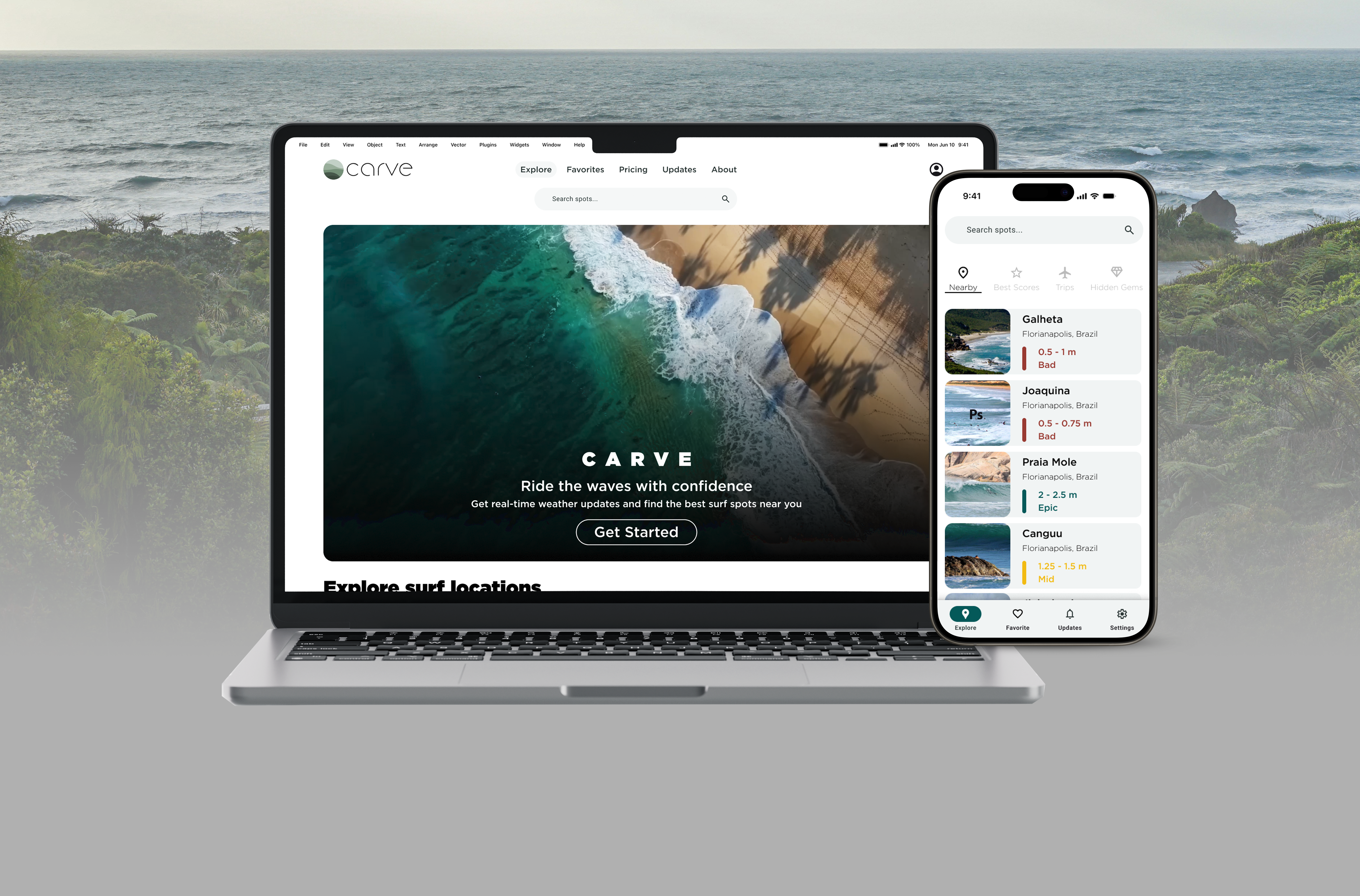
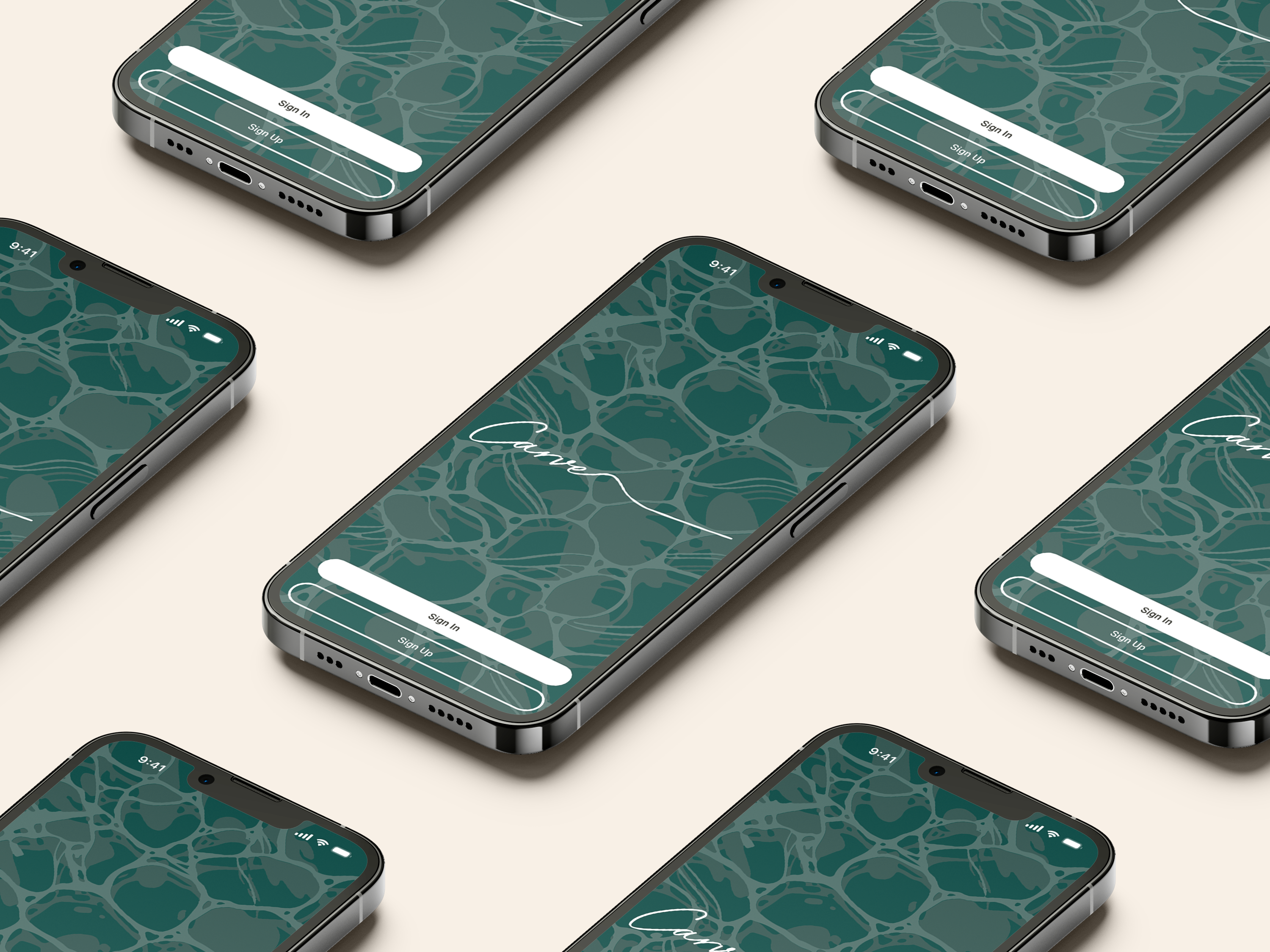
CARVE
I've created an intuitive and adventurous experience to help you decide where to surf.
CareerFoundry
Mar. 2024


About
Imagine planning a beach day, only to arrive and find it cloudy when you were expecting sunshine. It’s frustrating, right? Now, think about that same feeling but as a surfer. They need more than just a weather forecast—they rely on detailed information like wave height, wind direction, and tides to decide if it’s worth going out. But finding all that info can be overwhelming, with everything spread across different sites using complicated terms. This makes it tough for surfers to quickly understand conditions, sometimes leading to missed waves or even dangerous situations.
Idea
While browsing the internet, I searched for solutions to this problem and realized that almost every weather app struggles to create a seamless experience. Many apps, like Windy and Windfinder, rely heavily on maps to display weather data, making it difficult to compare information easily. Even the best option, Surfline, still had noticeable UX and UI issues.
To address this issue, I had to consider what is really important to surfers when planning their sessions. Is it just wave size, or are factors like wind direction also important? Should there be multiple layers of information, and if so, in what order?
What information is important?
Important features
More data
Building on this, I delved into market trends and analyzed user data to uncover the key factors surfers value most when planning their sessions. By examining competitors like Windy, Windfinder, and Surfline, I identified common challenges in creating a seamless user experience, such as overly map-centric designs and difficulties in comparing essential data. Combining these insights with user feedback, I prioritized critical elements like wave size and wind direction and explored how to layer this information intuitively. This process allowed me to design a user-centered solution that streamlined the experience and addressed the gaps found in existing weather apps.
To address this issue, I had to consider what is really important to surfers when planning their sessions. Is it just wave size, or are factors like wind direction also important? Should there be multiple layers of information, and if so, in what order?
63% of users
Mood
66% of users
Pain Points
100% of users
60%
Quote
User 1
Making Carve
With this data I created personas, mental models and user journey so I can eventually create an ideal user flow. I used this data to create personas, mental models, and user journeys. This helped me develop an ideal user flow and gain insights into user needs and preferences. These insights shaped the overall app structure, ensuring a user-centered design.
Who I made this project for?
Marco
Marco is a 45-year-old family man and surfer, married for 18 years to a fellow surf lover. With a 12-year-old daughter, they’re gaining freedom for surf trips, but unreliable weather apps often make planning these cherished moments difficult.
Goals and needs:
– Sharing trip details to his loved ones
– Be sure the information is reliable
– Plan surfing trips to his wife
Motivations:
– Escape routine
– Spend time with wife
– Exercise
Activities:
– Take his daughter to school
– Walks by the seashore
– Run errands after work
Frustrations:
– Not much free time
– Not reliable apps

Simone
Simone it’s a 23 years old fashion designer who runs a custom clothing brand, blending creativity with her clients’ needs. Introduced to surfing by friends, she now carefully plans her trips, balancing her passion for design and the waves.
Goals and needs:
– Enjoying time with her friends
– Organize her trips
– Customized experience
Motivations:
– Go places she knows she will enjoy
– Take a break from the city
– Get inspired by nature
Activities:
– Drinking beer with her friends
– Customize her design ideas
– Swim in pools
Frustrations:
– Do not live by the ocean
– Not customizable information
– To many apps with similar design
I thought about what users would want and how they would use the site. I designed the site map to make it easy for users to find what they need in a structured way. This helps them make decisions faster by letting them navigate through information layers efficiently.
First version
The original design had a grouped spot navigation, where users could see lots of options right on the first screen. These spot groups used a horizontal overflow, which made it easy for users to browse different surfing locations that might interest them.
However, after user testing the app with a small group, it became clear that the groups weren’t working as intended. I also ran into a limit on how many groups I could create as the page became too long and cluttered. In addition, the introductory video made the first screen feel crowded. Finally, the summary information on each spot card was too limited, forcing users to navigate to the spot page to check conditions, which was disruptive to the user experience.
So, to address this issues the latest design uses white space in it’s favor to make the main page less crowded and changed the groups section to a more common design patter that uses an icon menu to organize it. This allowed to focus the screens on spots rather than on groups. Also, adding a hover function on cards to give more information if the user is interested in a certain spot.

Next steps
Further user testing is necessary to refine the onboarding process and key interactions, ensuring that users can navigate the application seamlessly from the start. Additionally, optimizing the map and weather information displays will improve user engagement by making critical details easier to access and understand. To assess the impact of recent design updates, A/B tests will be launched, focusing specifically on the new card layout, helping to determine which variations resonate best with users and enhance the overall experience.