Autocad, used globally in the built environment sector, presents challenges to users of all level to it’s extensive command library, resulting in a steep learning curve. This is a cross-regional issue that affects users worldwide, as they work on a variety of projects primarily on desktop computers. As a result, frustrated users may opt for alternatives with a shallower learning curve, potentially damaging user retention rates.
Idea
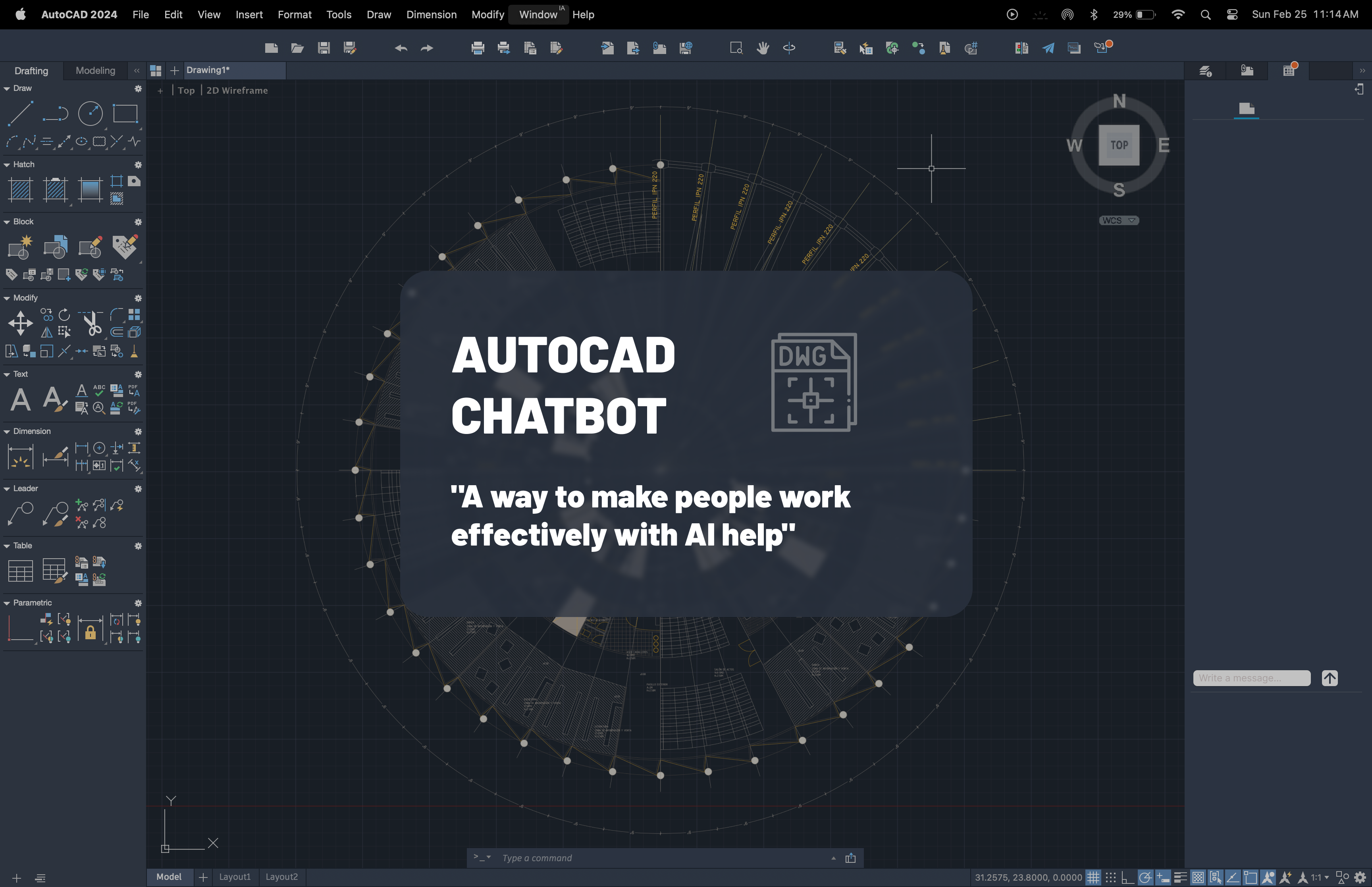
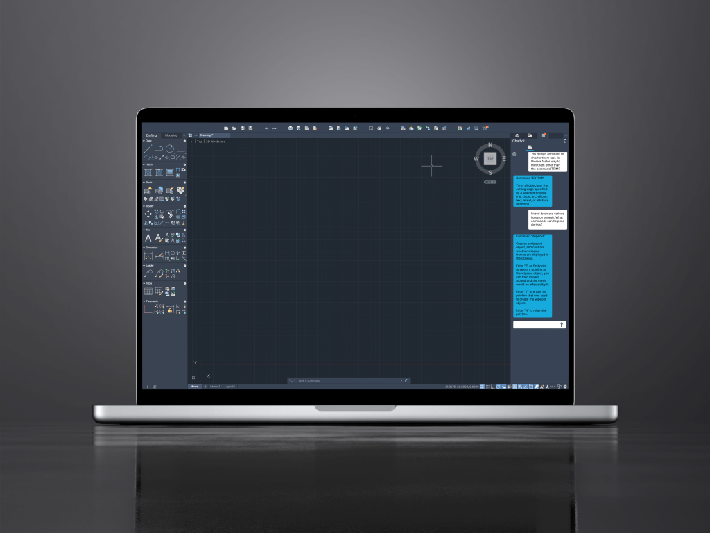
But what if there was a way to make AutoCAD feel more intuitive? Imagine having an AI assistant at your side, ready to guide you through tasks and recommend commands tailored to your specific needs. This chatbot would not only help users quickly find the right tool for the job but also learn from their preferences, reducing the time spent searching and increasing overall efficiency. With this approach, AutoCAD could enhance its user experience, keeping both new and experienced professionals engaged and productive.
To bring this vision to life, I developed a proto-persona based on research to ensure the design remains focused on the user’s needs and experience.
Proto-persona
Sophia
28 Years old
São Paulo, Brazil
Mid-level Structural Engineer
As a structural engineer, I want to be able to solve any problem while I'm drawing, without having to leave the interface, so I don't waste time researching.
Problems
Overwhelming Options: Sofia is frustrated by the numerous options to complete a task, unsure if they are the fastest.
Time-Consuming Process: Drawing in AutoCAD is tedious because every line must be manually created.
Repetitive Commands: Typing the same commands repeatedly slows down her workflow.
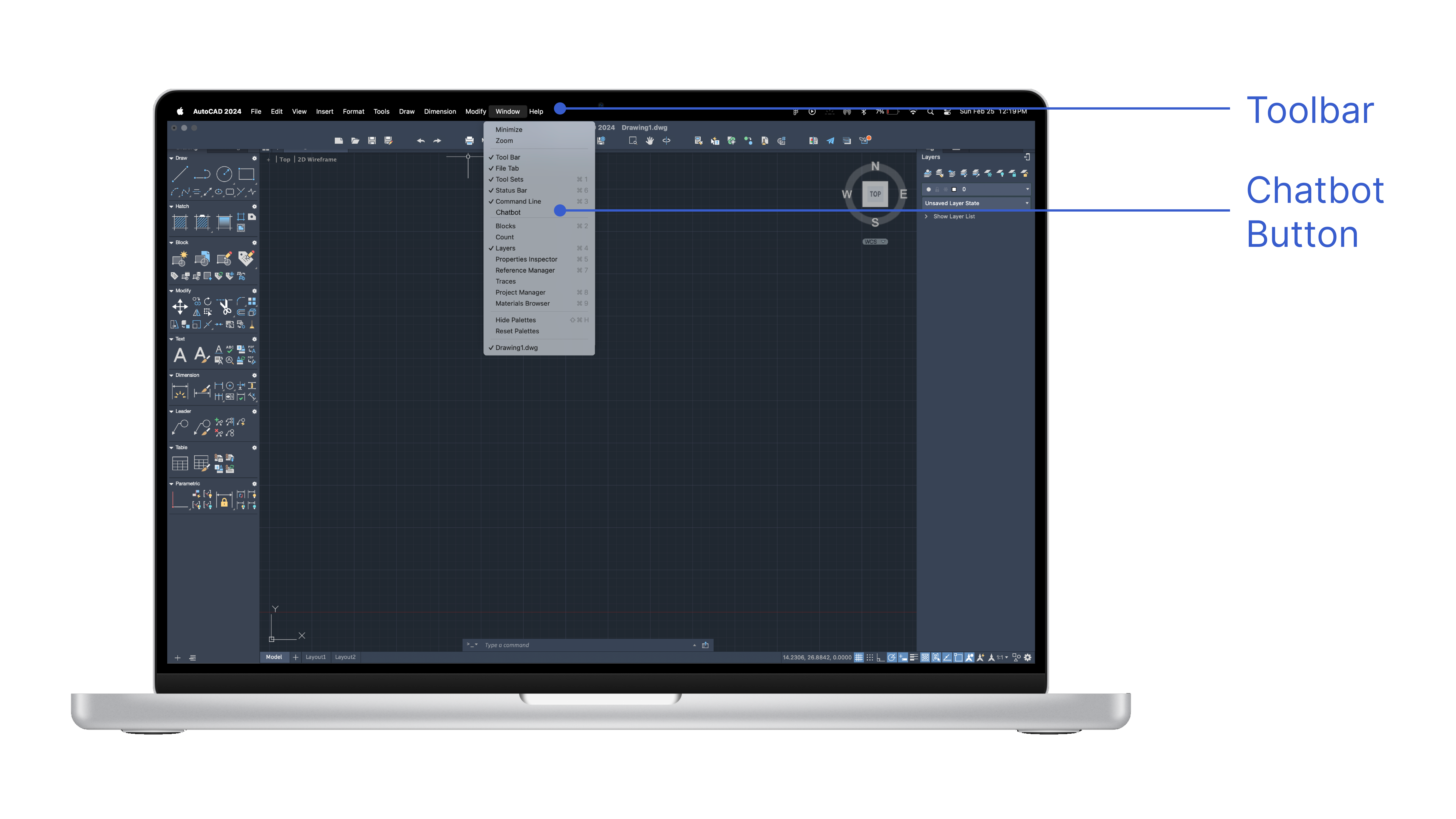
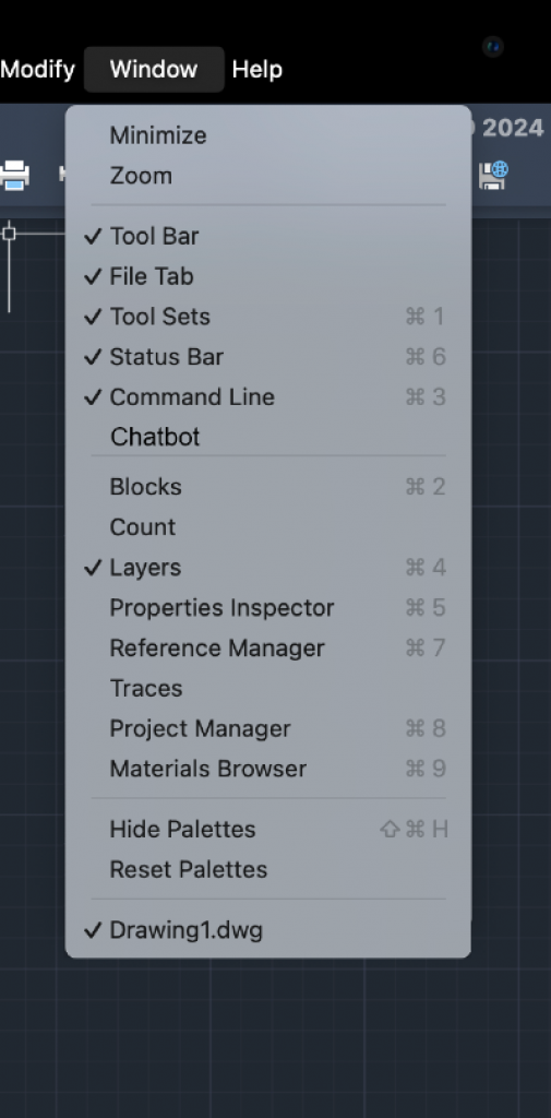
Layout Integration: The solution must adapt to AutoCAD’s existing layout, including the top menu bar.
Design
Iterations
After conducting usability testing with five users, I identified several key issues that impacted the overall user experience. These insights highlighted areas where the design fell short in meeting user expectations, revealing opportunities for improvement. This feedback provided a clear direction for refining the product and ensuring it aligns more effectively with user needs.
Here are the errors I encountered and how I addressed them.
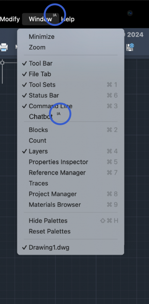
Location
Novice users struggled to find the AI help tab.
Add visual cues to highlight the tab.
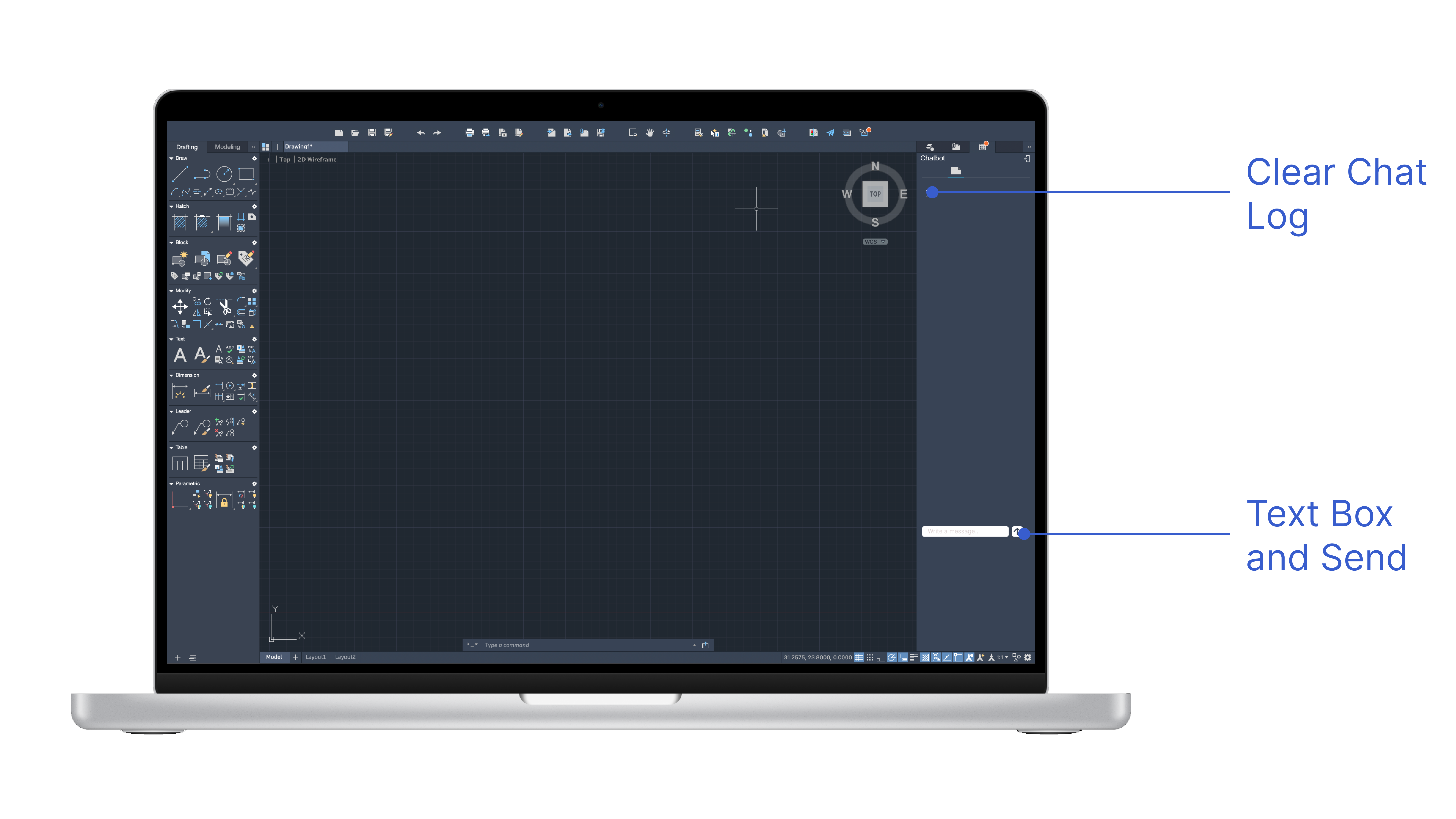
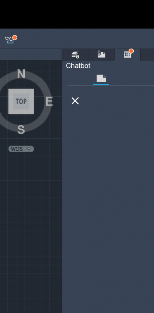
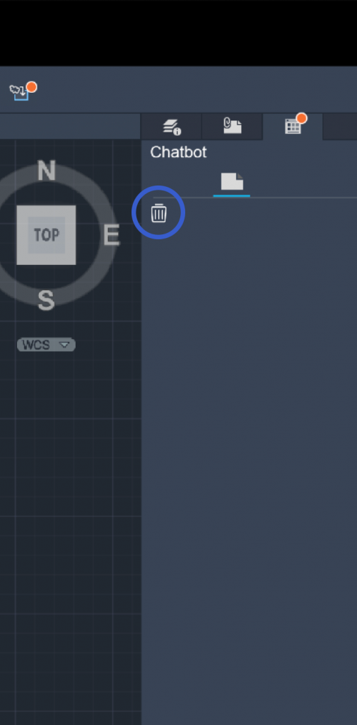
Clear Chat Icon
Users thought the "X" would close the program, not clear the chat.
Use a more intuitive icon or tooltip.
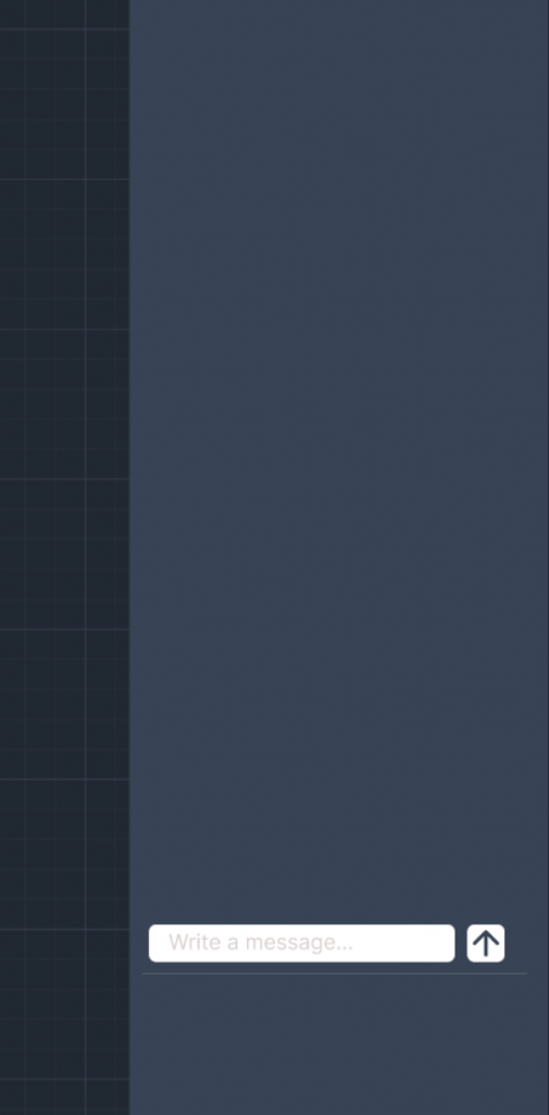
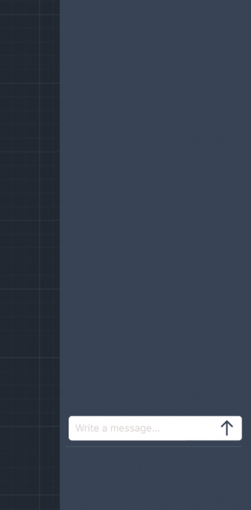
Text Box Size
Text box was too small for users to interact with easily.
Increase text box size for better usability.
Mockups
In the final designs, I’ve ensured seamless integration with the existing UI, maintaining consistency while enhancing usability. The changes were carefully implemented to address the identified issues, providing a smoother and more intuitive experience for users. By aligning with the established design language, the updates not only improve functionality but also preserve the overall aesthetic and flow. I’m confident these refinements will better meet user needs and optimize their interaction with the product.
What's Next?
This feature enhances workflow efficiency by enabling users to complete tasks more quickly and effectively. It is designed to accelerate proficiency with the program, ultimately allowing users to reach a point where the feature is no longer necessary. However, to further streamline the process, a new function is needed to address the repetitive task of manually inputting commands. By leveraging user habits, this feature would provide intelligent suggestions during work, allowing users to simply press a button and let the system assist them, eliminating the need for constant command input.